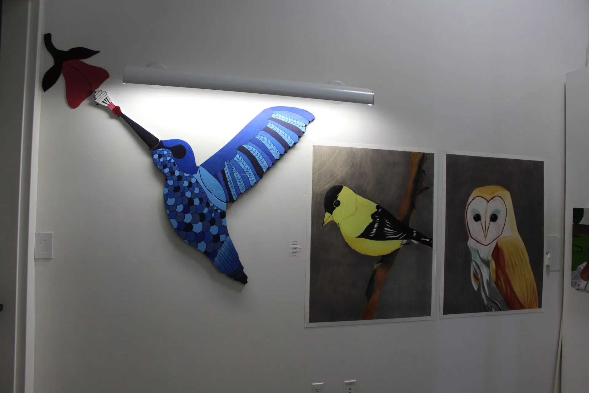
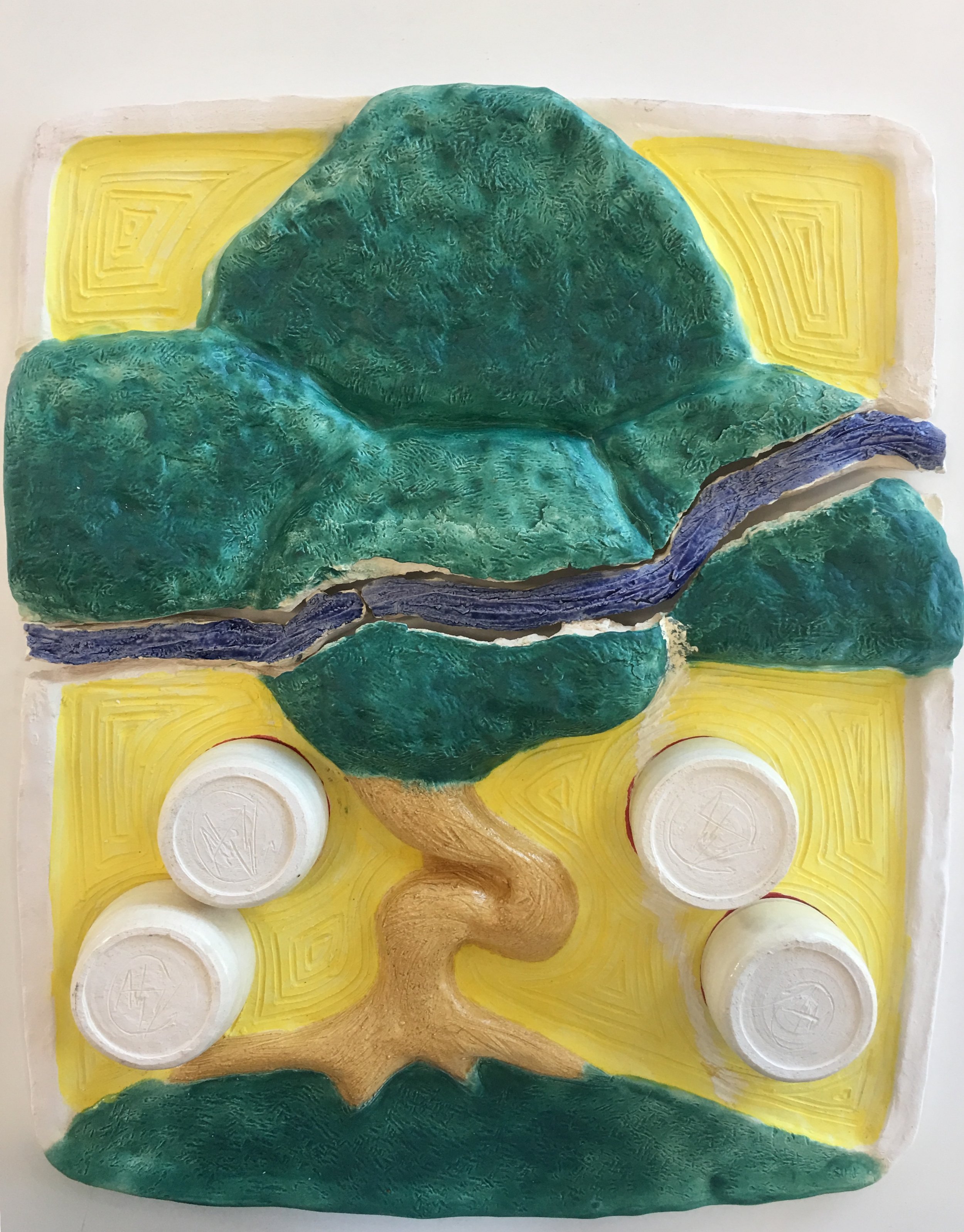
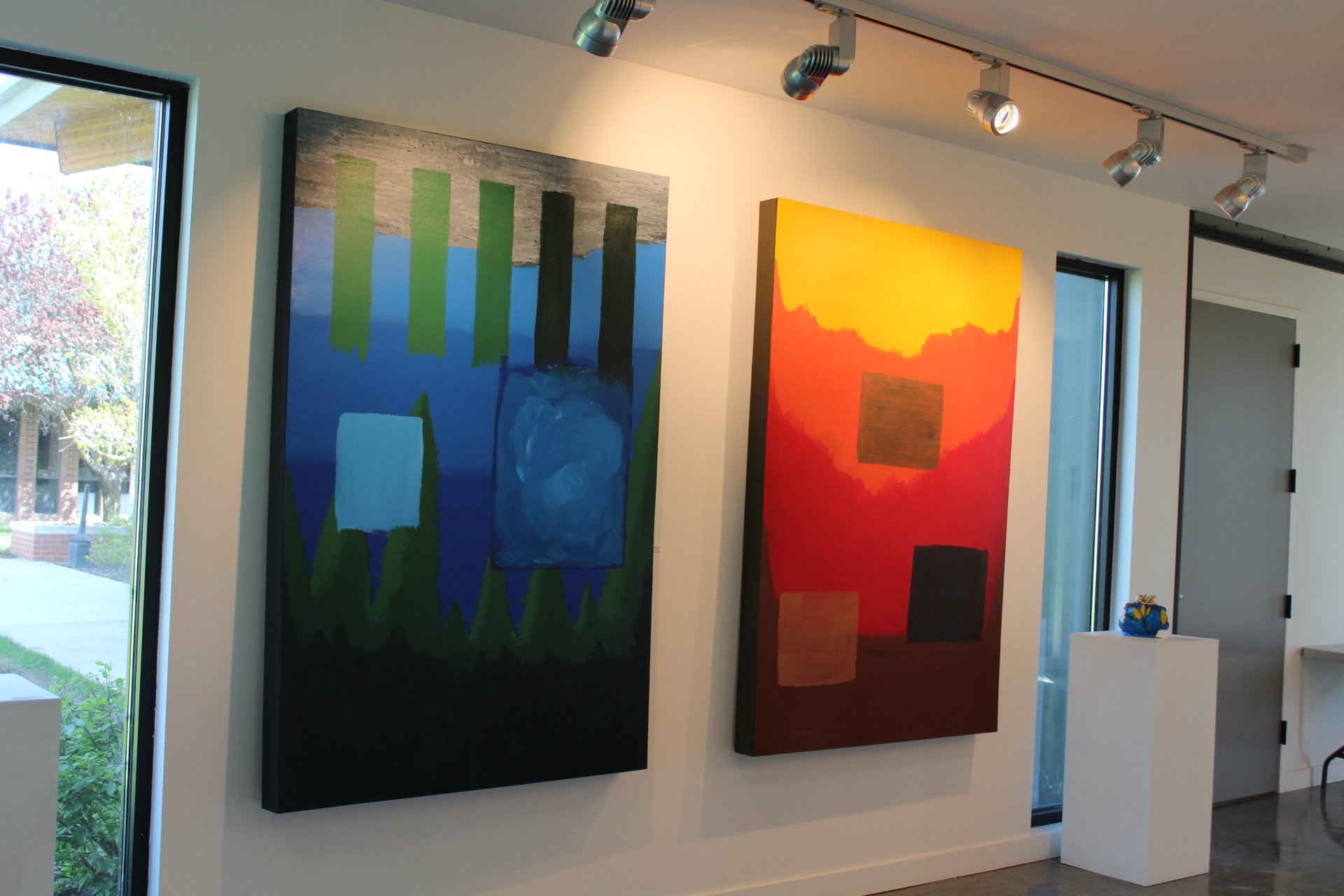
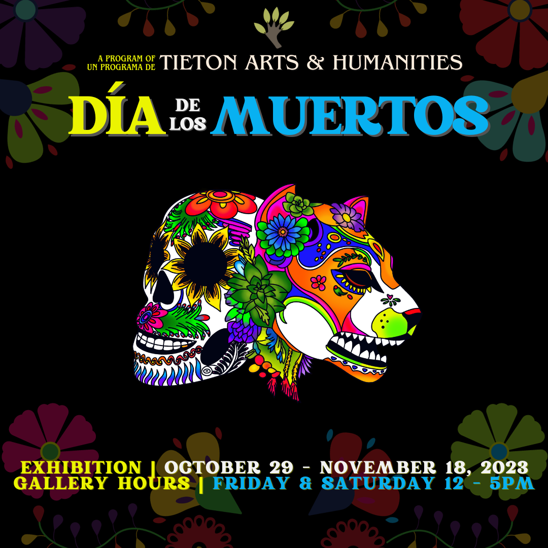
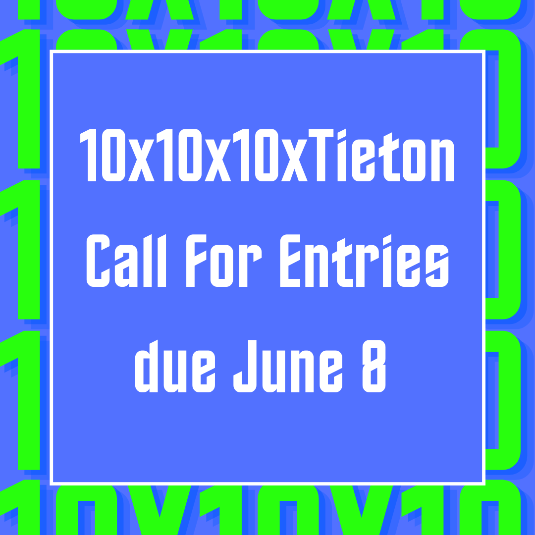
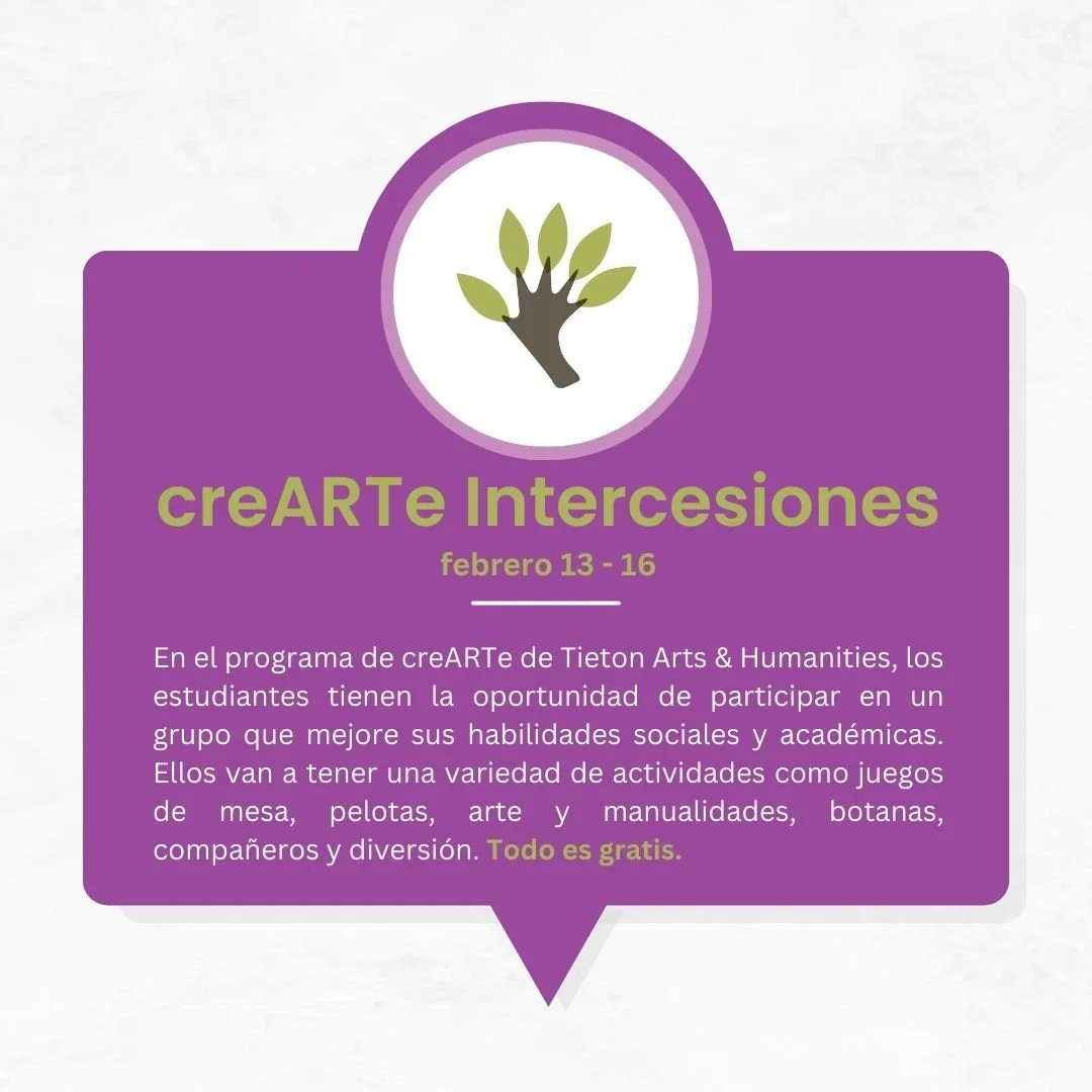
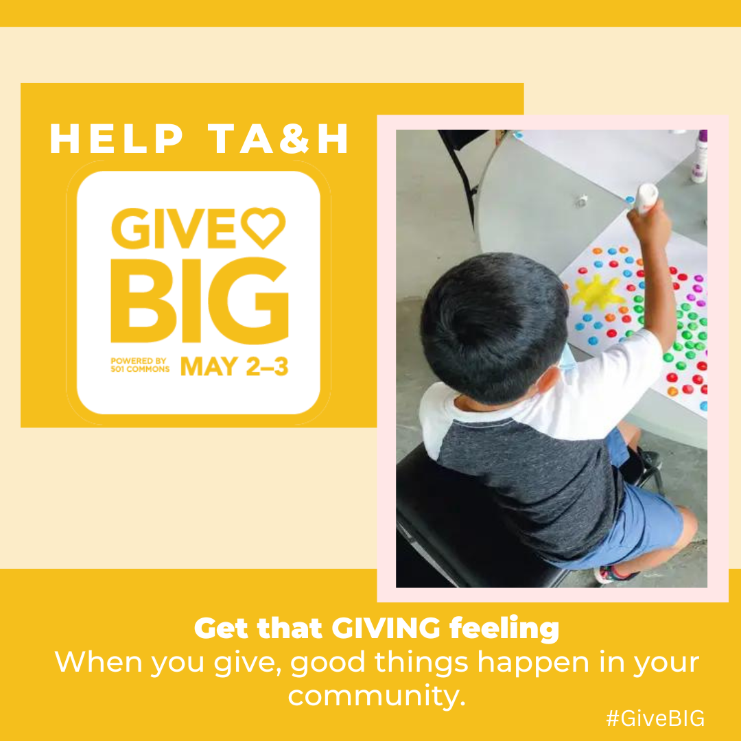
Current Work
Some of the graphics I have created over the year at TA&H as their Communication Manager.
Client
Tieton Arts & Humanities
Year
2023 - Ongoing
Certificate in UX and Visual Interface Design
-
![]()
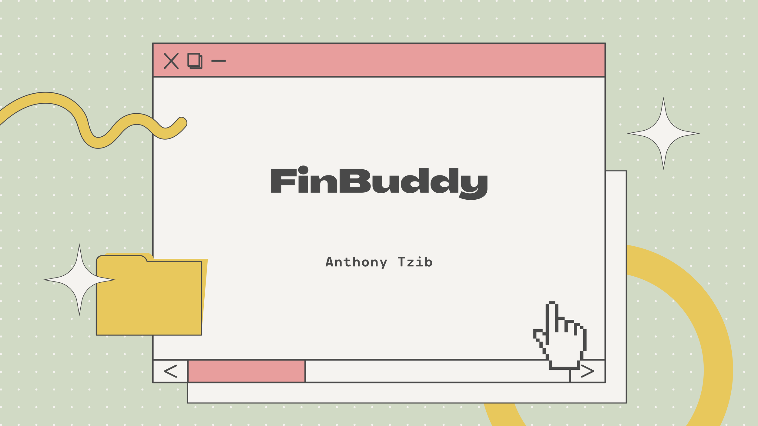
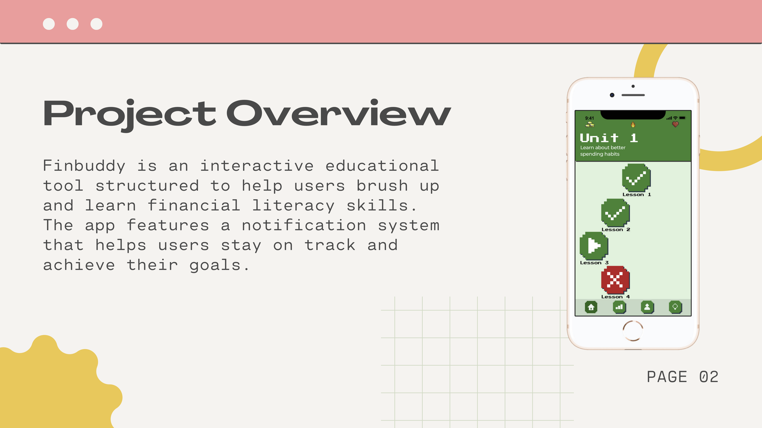
FinBuddy
In my Certificate program, I spent five months creating an interactive educational tool similar to DuoLingo to help users learn about financial literacy. I named it FinBuddy.
-
![]()
Project Overview
I was able to gain a lot of invaluable information regarding UX and the different avenues I could take.
-
![]()
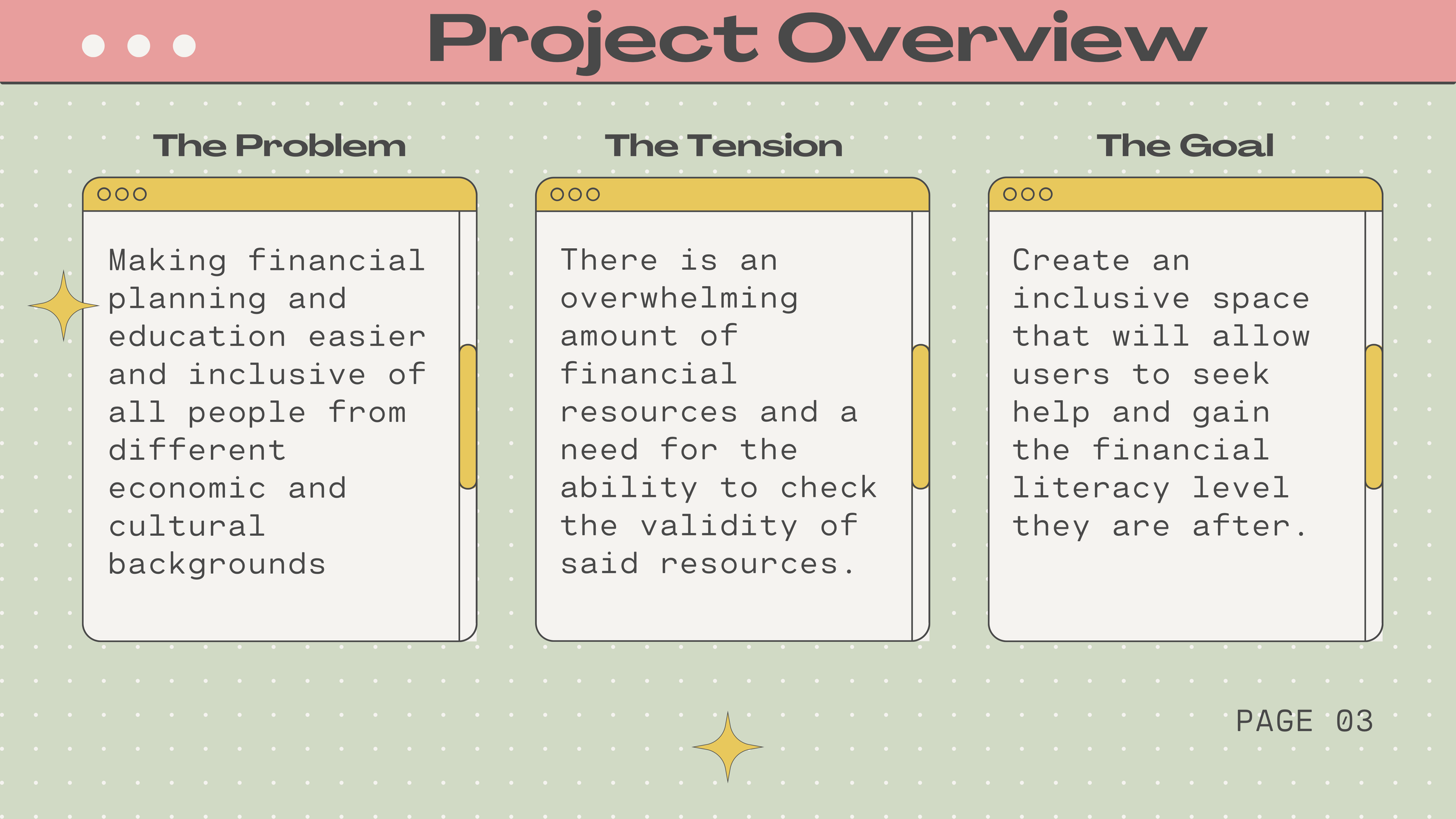
The Problem, The Tension, And The Goal
In the first course, we grouped up, found our problem, and started to brainstorm and work on solutions.
-
![]()
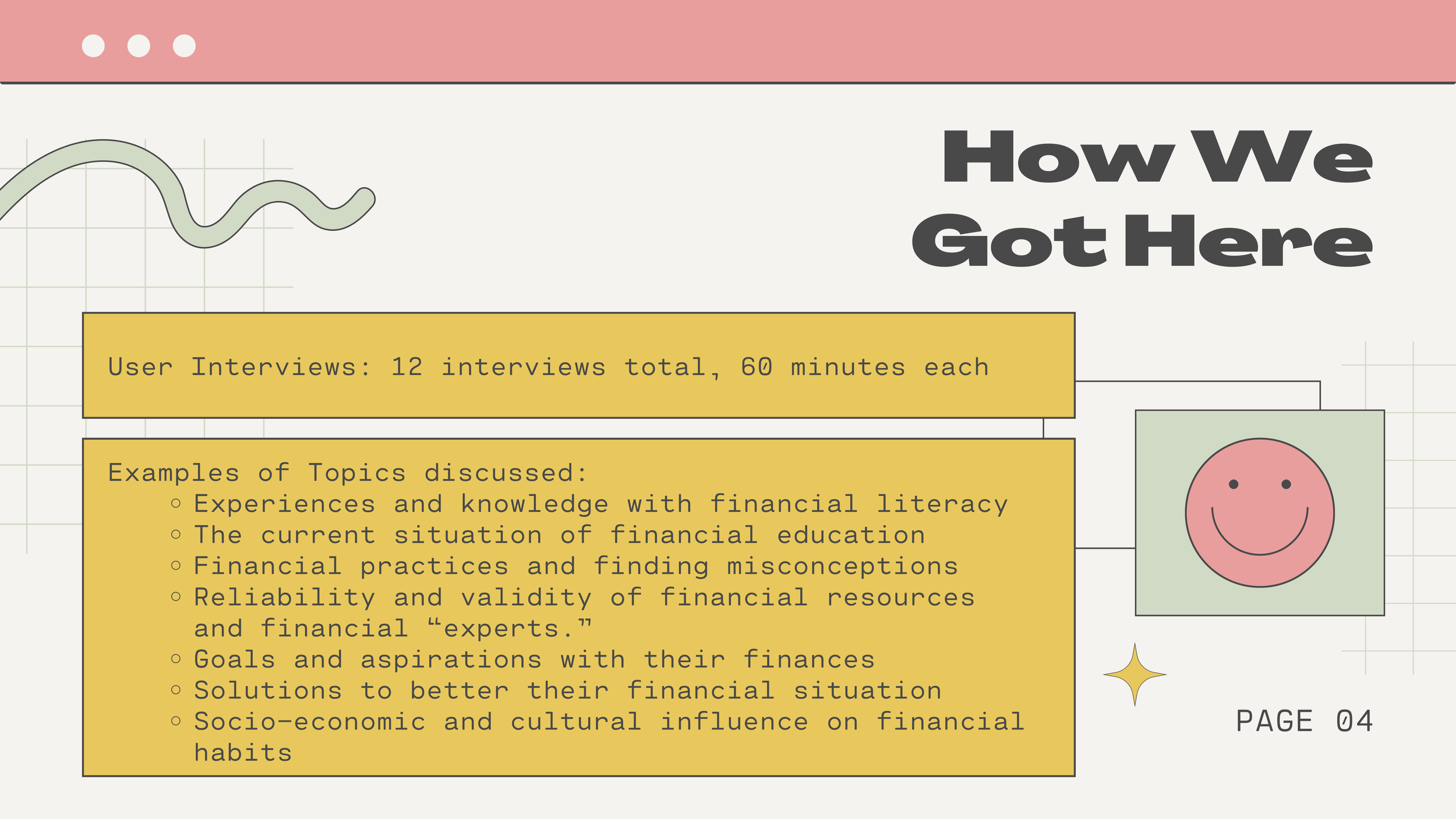
User Research
To help with conducting research, we hosted 12 user interviews that helped us understand what issues people faced when dealing with financial literacy.
-
![]()
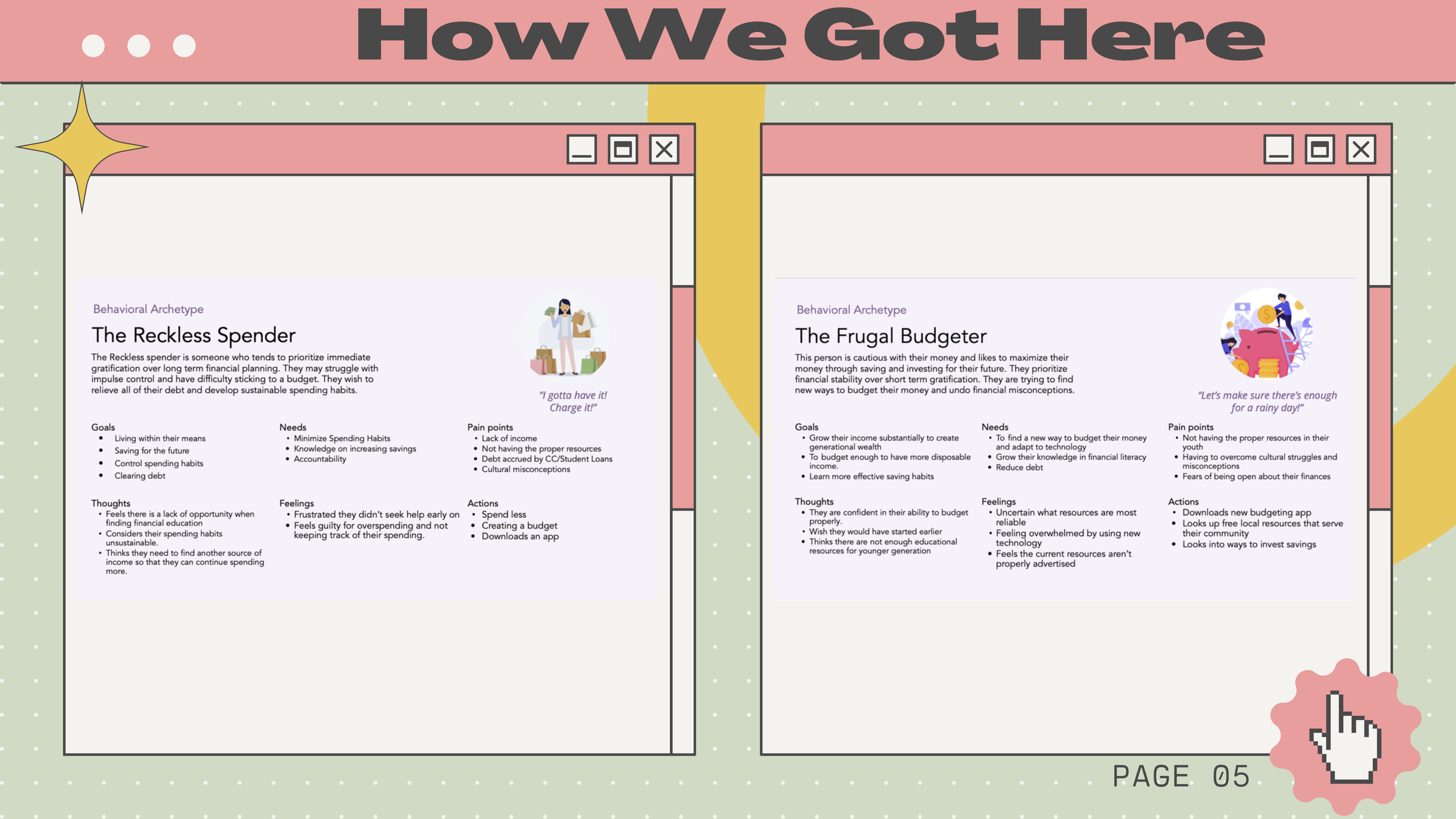
Behavioral Archetypes
After the user interviews, we came up with two different archetypes to aid us in creating our solution to the financial literacy crisis: The Reckless Spender and The Frugal Budgeter.
-
![]()
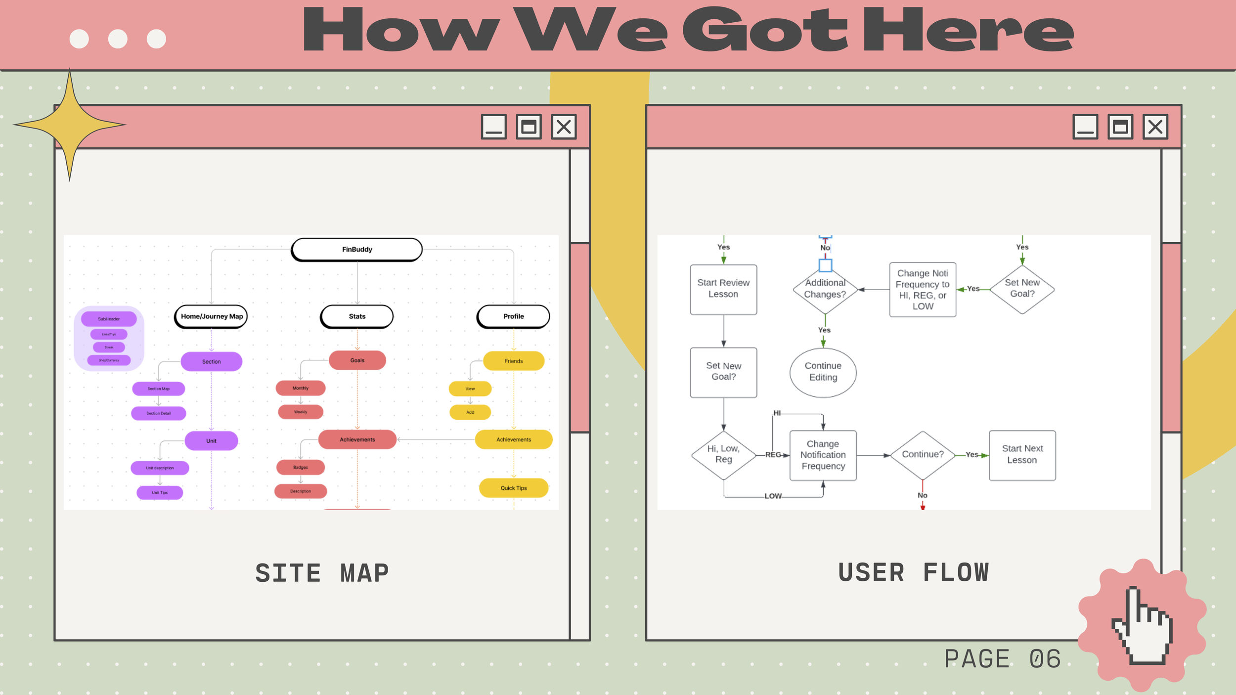
Site Map & User Flows
In the second course, now separated into individual projects, we learned how to create site maps and user flows. Both of these procedures helped us gain insight into how to better understand and optimize the information architecture of our product.
-
![]()
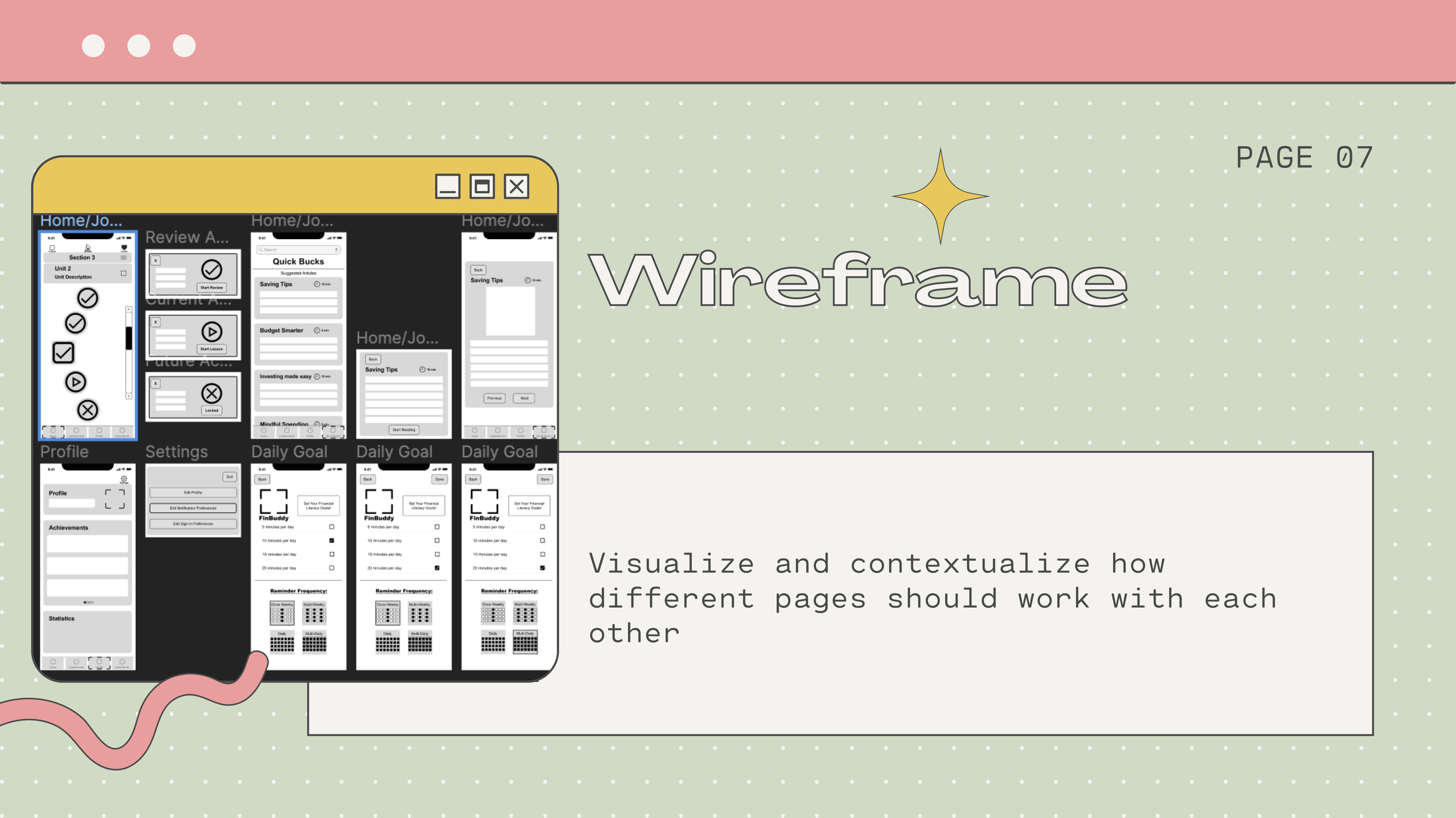
Wireframes
Once I understood my product’s user flow, I could create a low-fidelity prototype that would help aid my future design language.
-
![]()
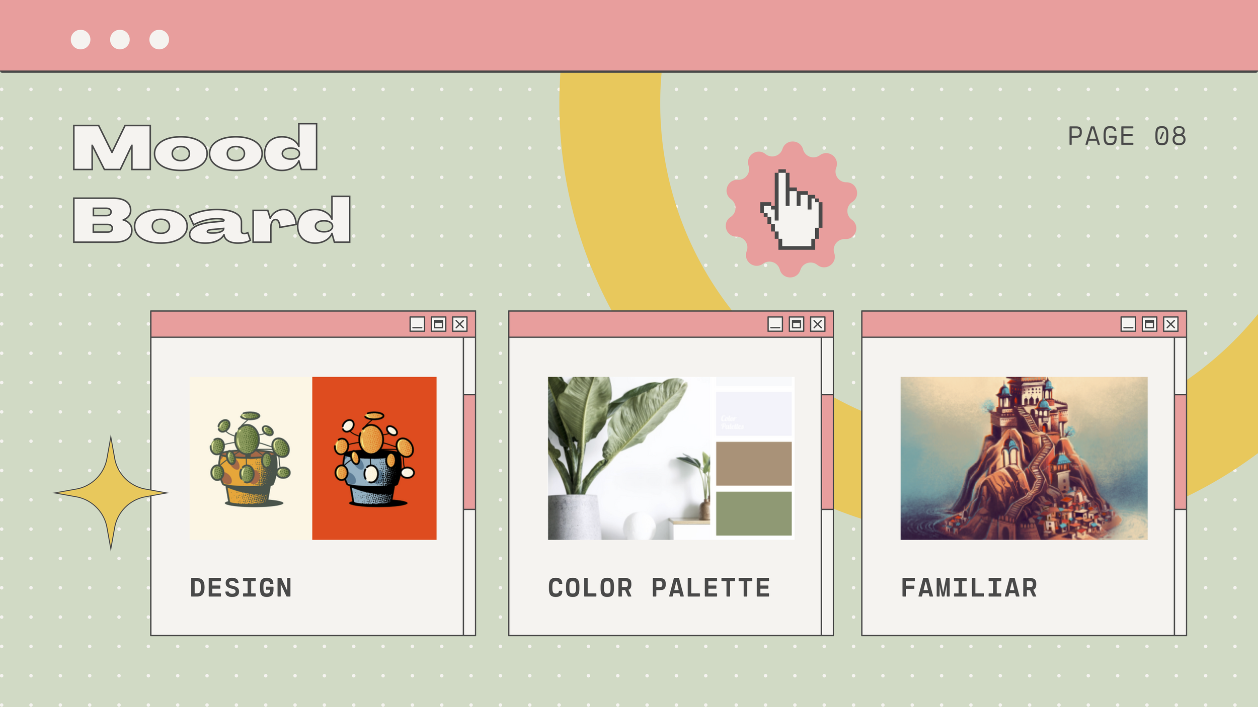
Mood Board
The last course delved into the design process. We created mood boards to gather all of our inspirations into one place.
-
![]()
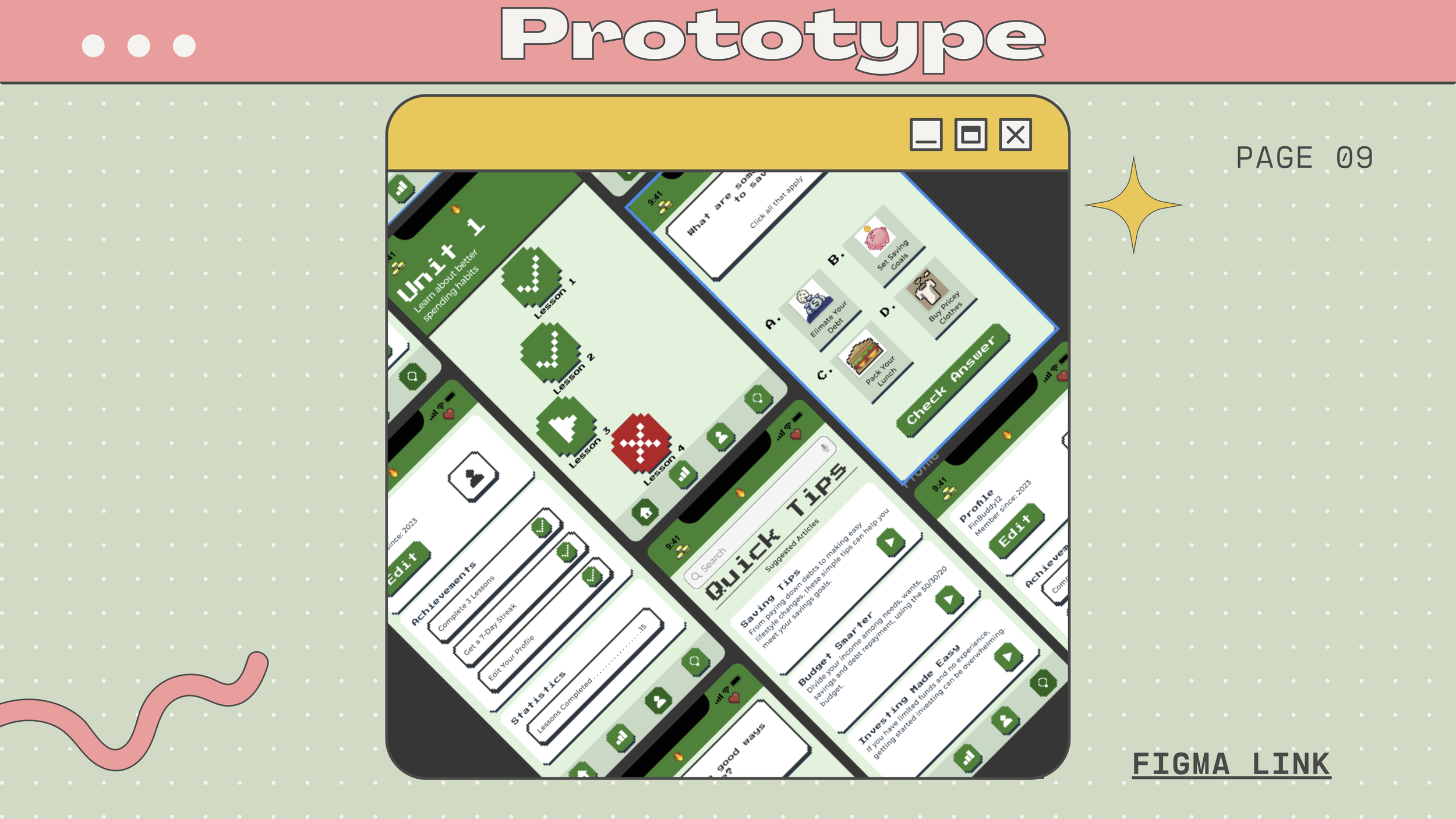
Prototype
Once all the colors, typography, layout, and icons were chosen and created, I could make the final prototype. FinBuddy was a great learning experience, but I wished I had done things differently. The art style felt limited, and the color palette needed help to be more accessible. Even though there were hiccups with FinBuddy, I am still proud of what I accomplished on my first go-around. If you’d like to try Finbuddy, here is the Figma Link.
Traditional Work
Selected work I used for my Thesis Exhibition in 2019. My work examines my life’s experiences, emotions, and memories rooted in the State of Washington.
Client
Heritage University
Year
2019